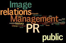
 Infographics are taking the PR world by storm largely because of their versatility. When most effective they provide structures for organising, planning and studying information. This can help to reveal connections between information that are not as visible without graphic representation.
Location: Show where something is in the form of a map or another visual representation as opposed to just referring to it. For example different places where the promotions for your new places could be depicted visually showing some kind of link between the places that could lead to a possible marketing spin off.
Comparisons: Visually compare two things by placing them side by side with appropriate enhancing visuals and supporting text. For example show how your latest offering is a step above your previous one by contrasting the two visually.
Highlight important points: Infographics can allow you to show the most important pieces of information by using different colours for example. This can place a great emphasis on stats and numbers making them easier to analyze.
Use animations and drawings: Some things are better and more quickly represented when animations and drawings are made use of. This can also be a great starting point for representing ideas quickly that can be further developed later.
Organise items into groups: Show relationships and connections between certain items by grouping them together. For example if research is being done on the consumers of the organisations products they can be grouped according to their age group or gender etc.
Break things down: Use graphics to break things down into individual components which can help you better explain the “whole” that they form collectively.
Show structure: This is the opposite of breaking things down; you can use graphics to show how an entire system operates or what an entire structure looks like.
Use flow charts: Showing something such as an organisations strategy for example can be done with ease using a flow chart.
Look Away/Cut inside: Show how something is internally by using this method. For example in engineering the internal structure of a building can be 3Dimentionally represented while the outside is still visible.
No comments:
Post a Comment